Gesto.
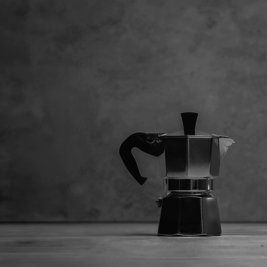
Gesto, a modern day coffee brand influenced by Italian coffee culture and Italian gestures will soon be serving great coffee and food in authentic coffee bars across the UK and Ireland. Gesto (a direct translation of gesture) offers a space for coffee drinkers to express themselves using Italian gestures to describe their coffee and food in a fun way.
Services.
Brand research.
Brand strategy.
Brand identity.
Design system.
Logo design.
Motion design.
Implementation.
Brand strategy.
Brand identity.
Design system.
Logo design.
Motion design.
Implementation.
Brand Strategy.
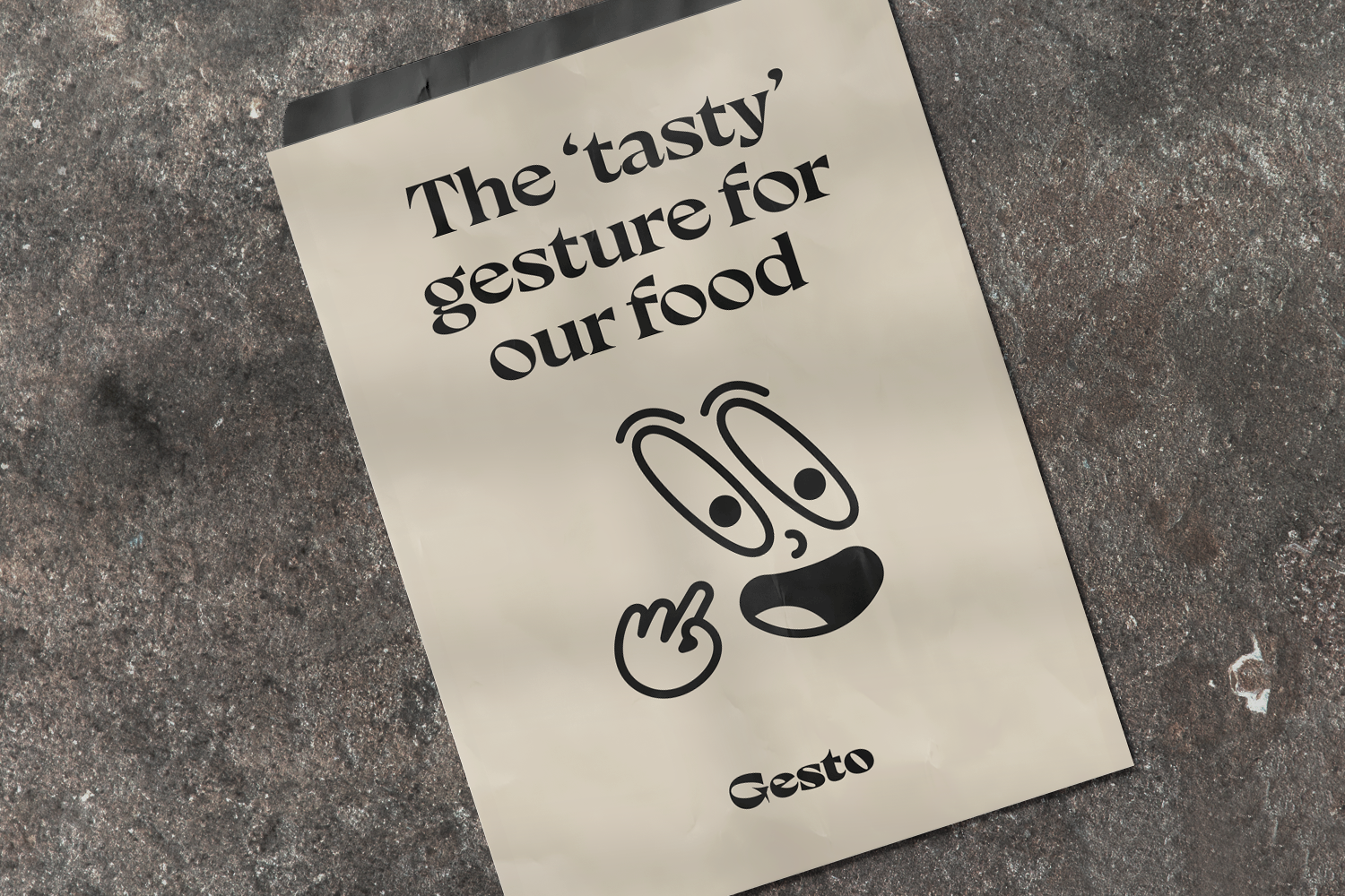
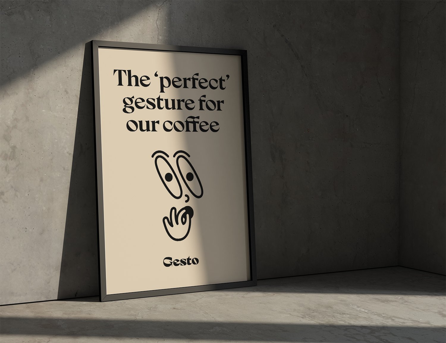
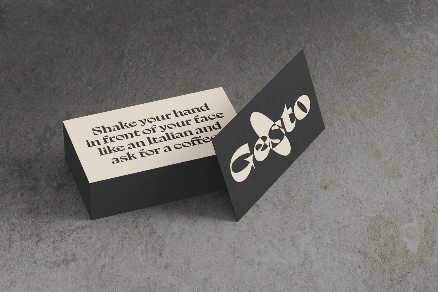
Italian coffee bars are a gathering place, a centre of social life for their community. Gesto’s vision is to bring the fine art of Italian coffee bars and culture to the UK and Ireland serving great coffee and food. Gesto coffee bars provide an authentic Italian coffee space where customers are encouraged to communicate with their hands through gestures. Gesto educates their customers how to gesture to describe their coffee and food in a fun way.


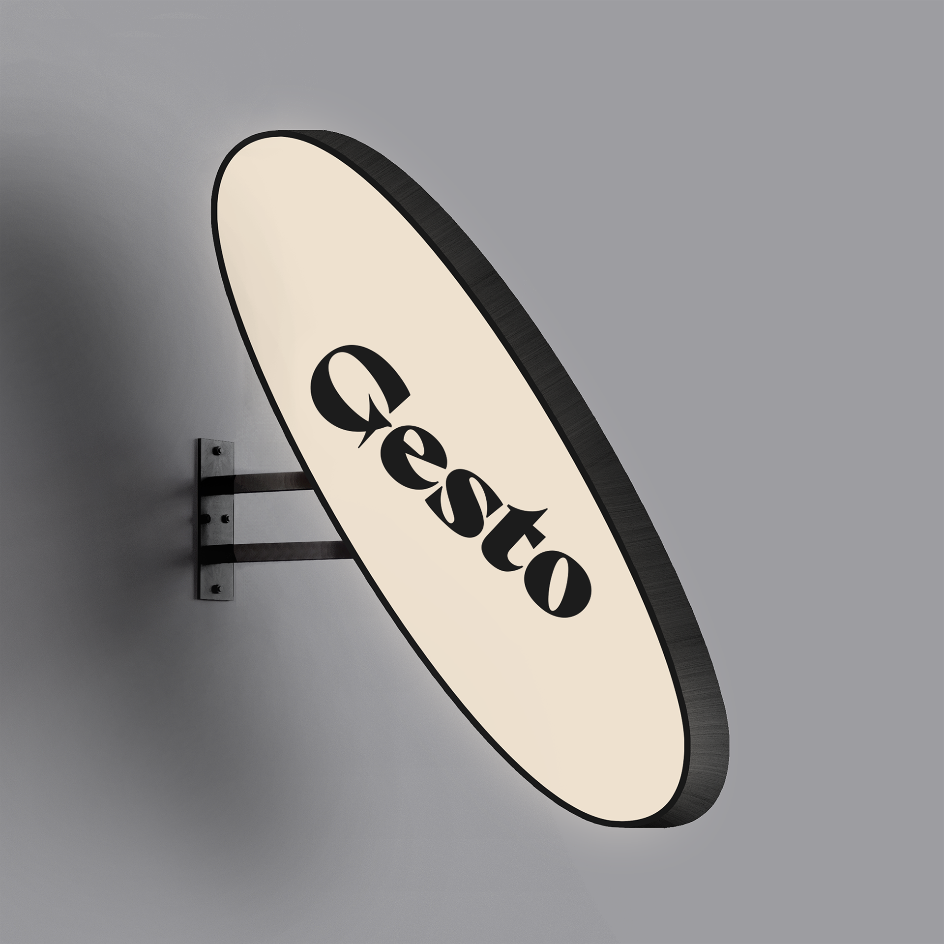
Logo Design.
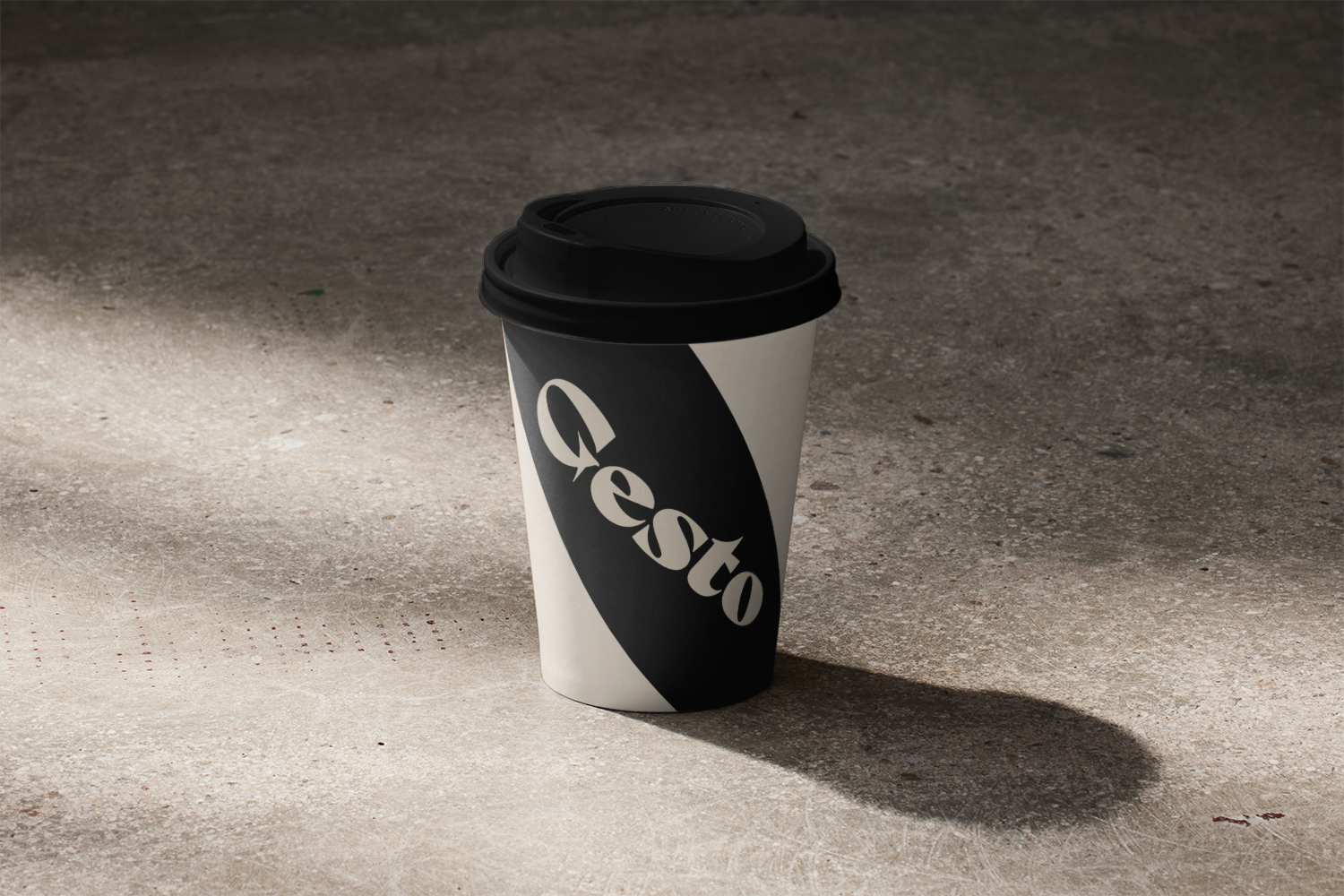
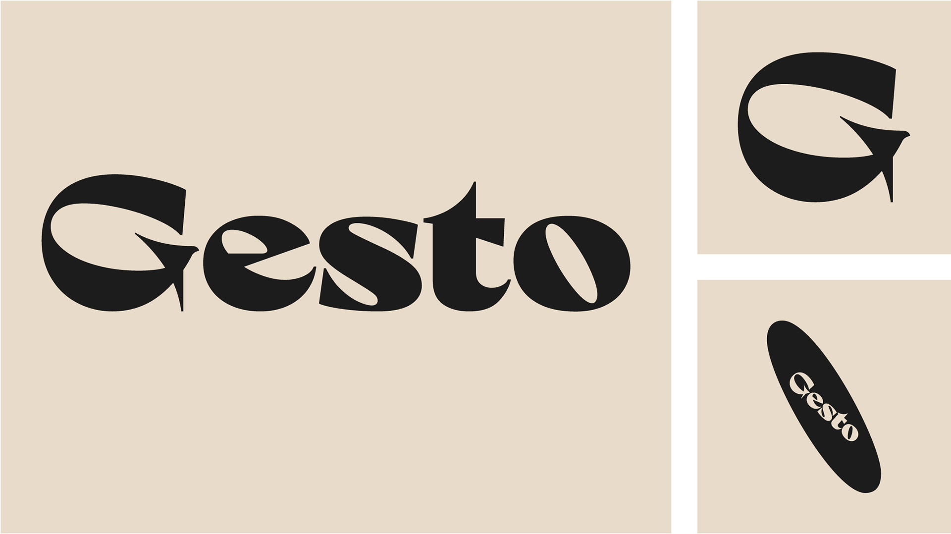
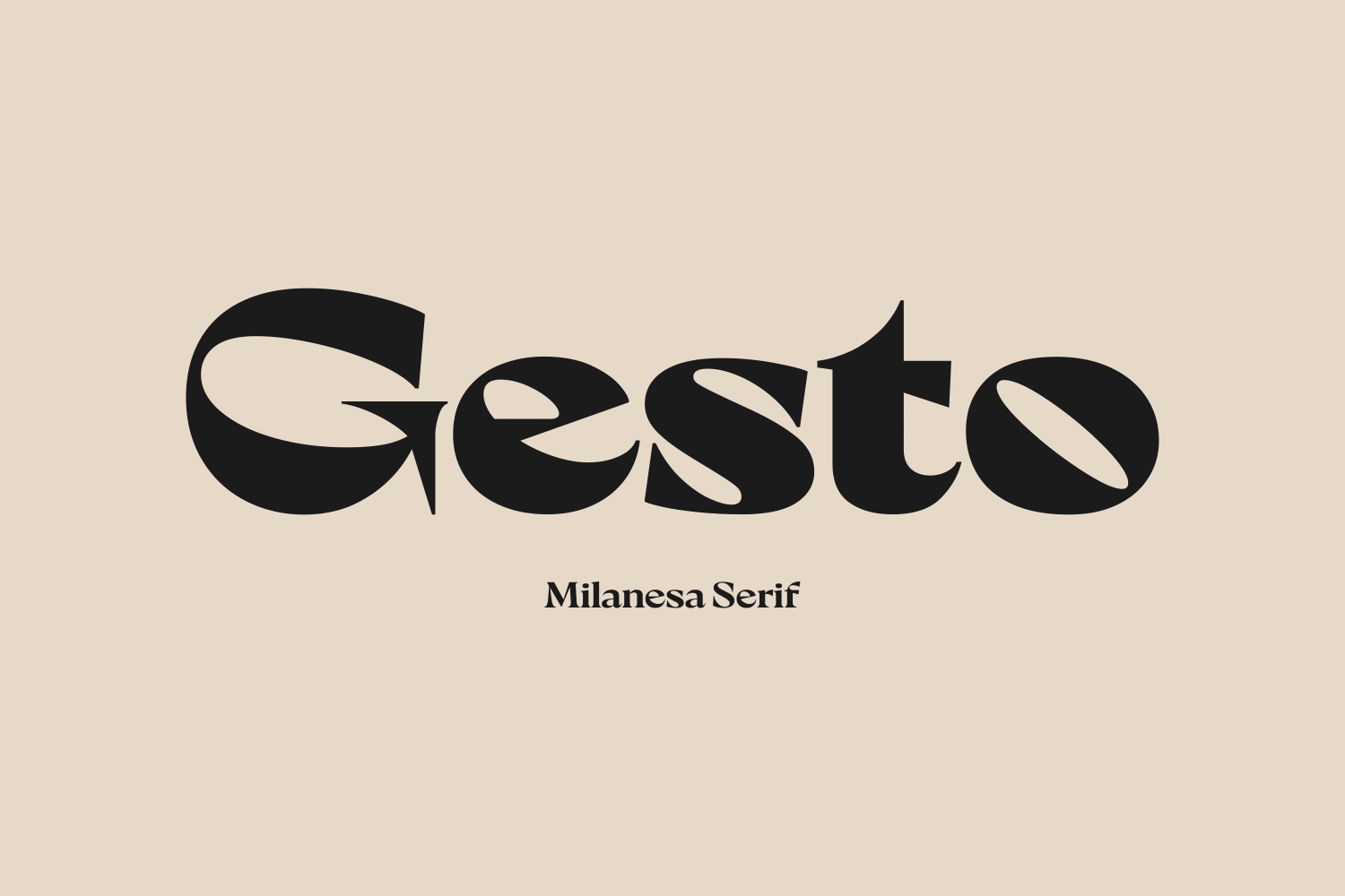
The Gesto logotype represents the authentic, fun and modern characteristics of the brand. The letter ‘G’ has been manipulated to include the spout of the Moka pot in it’s serif in an unassuming way while the counter in the ‘o’ is rotated to a 30 degree angle to resemble the coffee bean shape. The serif typeface represents the authentic Italian experience of Gesto in a modern way.
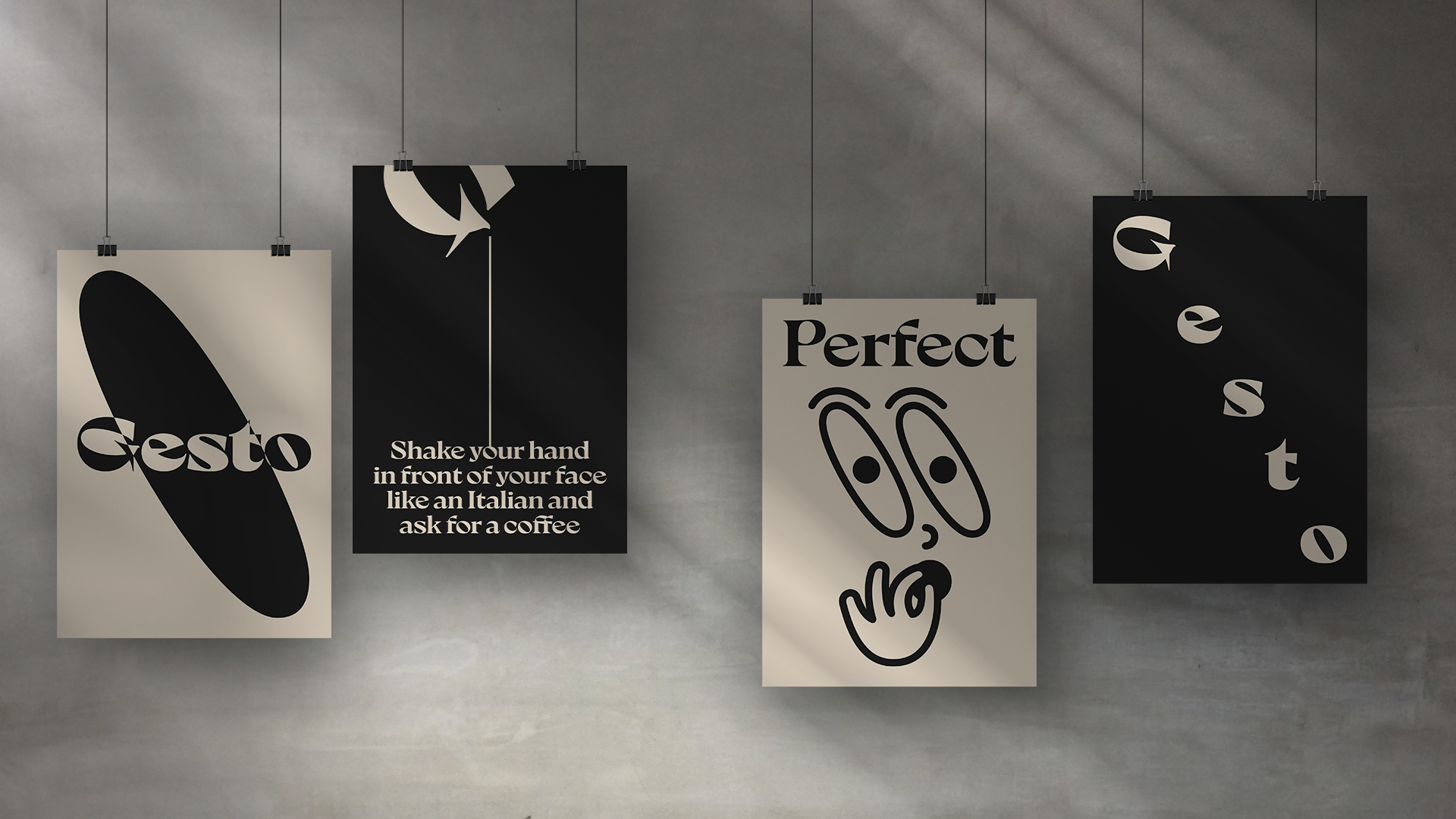
Visual Identity.
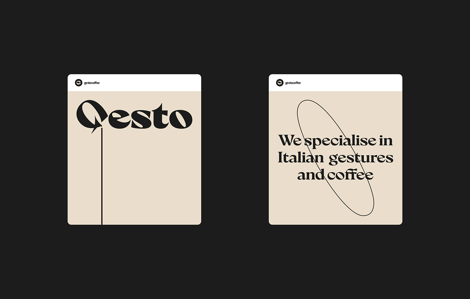
Gesto is visually timeless, with its muted and restricted colour palette giving the brand an authentic feel. The coffee bean shape created in the counter of the ‘o’ in the logotype is doubled up to create a set of eyes that are used in the fun gesture illustrations, used to educate customers how to describe their coffee and food.

Implementation.
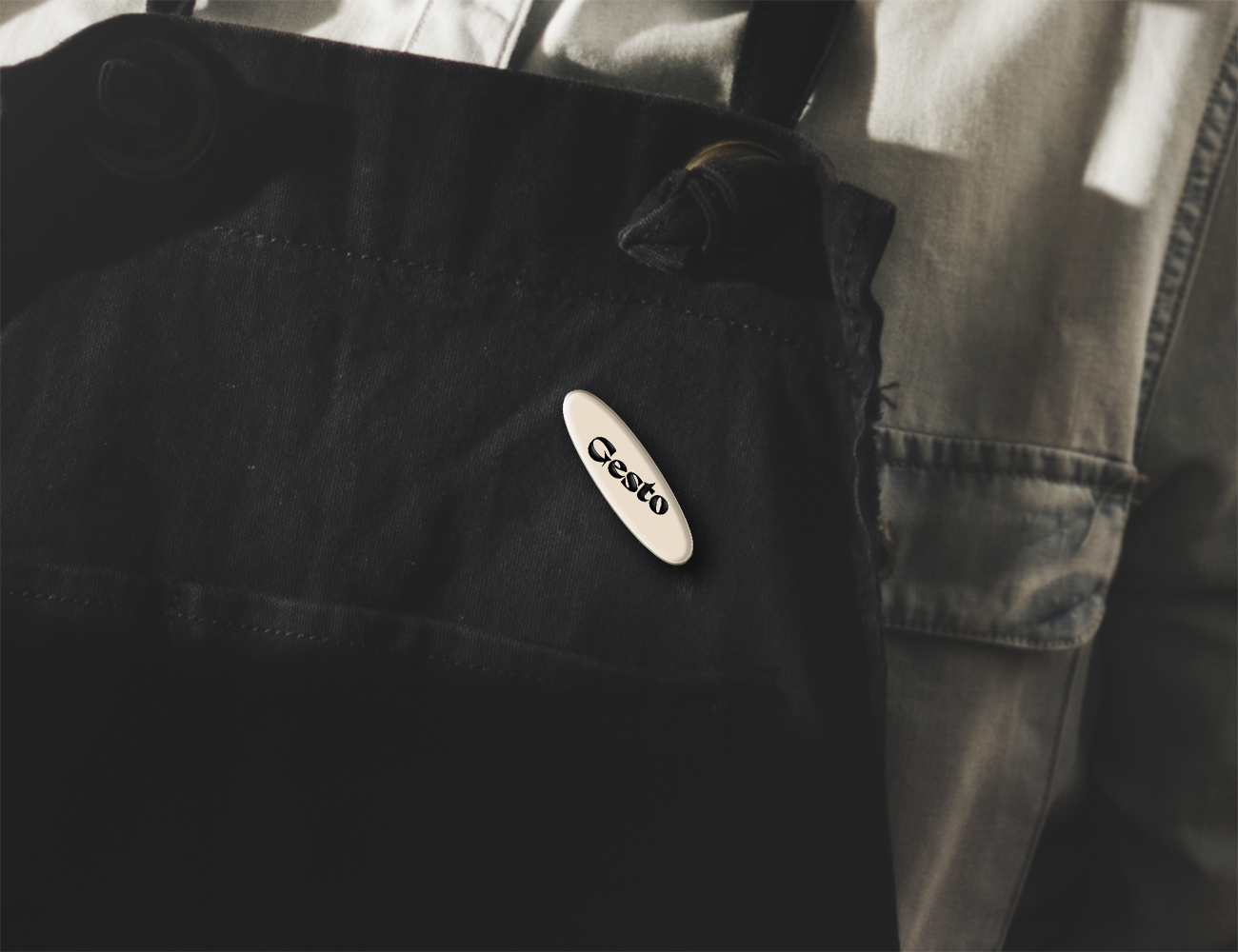
The Gesto brand is rolled out for a range of touch points including signage, packaging and editorial.